


Why Users Leave Beautiful Websites in Seconds (And How to Fix It)
Website Usability
Website Usability
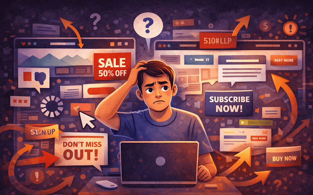
Websites can look perfect.
Modern layouts.
Smooth animations.
Vibrant visuals.
Everything appears polished, professional, and inviting.
Yet visitors leave often in seconds.
Not because the design is broken.
Not because the colors are off.
Because the website isn’t clear.
Clarity is the difference between a visitor staying and converting or leaving before even exploring.
Visitors don’t scroll to admire a website.
They decide:
What is this website about?
Is this relevant to me?
What should I do next?
If these questions aren’t answered within a few seconds, visitors leave.
This is why website clarity is far more critical than beauty alone.
Even a visually stunning site can fail if users cannot understand it instantly.
Focusing solely on aesthetics often leads to hidden issues that drive visitors away.
Many websites overload pages with:
Multiple headlines
Buttons everywhere
Animations, icons, sections — all trying to grab attention
When everything stands out, nothing truly stands out.
Example: A homepage with five primary CTAs and three animated banners. Visitors don’t know where to click, so they leave.
Reducing visual clutter and guiding attention to one primary action is essential.
Without a simple, intuitive path, visitors don’t know where to go next.
Where should they click?
What is the main purpose of the page?
How does each section relate to the next?
A clear user journey ensures that visitors move naturally toward conversion points. Without it, even a beautifully designed site can feel like a maze.
Tip: Use visual hierarchy and section headings to guide the eye. The first thing users should notice should always relate to the main action.
Modern visuals can give the impression of sophistication, but if actions require too much thought, the experience feels difficult.
For instance:
Hidden menus or unconventional navigation
Overly complex forms
Buttons that don’t clearly indicate what happens when clicked
Good UX should feel effortless, intuitive, and natural. Visitors should know what to do without thinking.
Even a clear layout can fail if visitors don’t know what to do next.
Scrolling endlessly without guidance creates indecision. Without a strong, clear CTA, users do nothing.
Example: A landing page with a great product description but no “Buy Now” or “Book a Demo” button. Visitors leave because the next step is unclear.
Improving website usability isn’t about adding more design — it’s about making the site instantly understandable.
Every page should have one main goal.
Sign up
Book a demo
Start a free trial
Multiple goals dilute attention. One clear action increases conversions and keeps visitors engaged.
Pro Tip: Highlight the primary action using color, placement, and spacing. Make it impossible to miss.
Remove unnecessary elements and reduce visual noise.
Limit distractions
Use white space strategically
Focus attention on what matters most
Simplified layouts guide visitors toward conversion naturally.
Example: A single, large hero section with a clear CTA is far more effective than a cluttered homepage with ten sections competing for attention.
Guide the visitor’s eye using size, color, contrast, and positioning.
Important content should be bigger and higher on the page
Less important details can be smaller or lower
Maintain consistent spacing to avoid overwhelming the visitor
Visual hierarchy reinforces good website usability, making it easier for visitors to process information and act.
Before adding any animations, effects, or decorative elements, ask:
“Will a visitor understand this in three seconds?”
If the answer is no, simplify.
Clarity should always come before decoration. Beauty without clarity may impress briefly, but it doesn’t retain visitors.
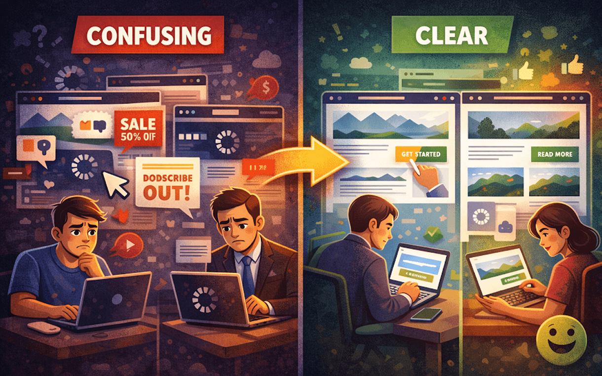
Scenario 1: Confusing Site
Five CTA buttons
Multiple animations competing for attention
Hidden menu and unclear hierarchy
Result: Visitors leave in seconds.
Scenario 2: Clear and Simple Site
One primary CTA
Clean layout with whitespace
Visual hierarchy guides the eye naturally
Result: Visitors stay, scroll, and take action.
Consistent Navigation: Users shouldn’t think about how to move around.
Readable Typography: Clear fonts improve comprehension instantly.
Fast Loading Times: Even the clearest website fails if it loads slowly.
Mobile-Friendly Design: Most visitors access sites via mobile; clarity must extend to small screens.


