
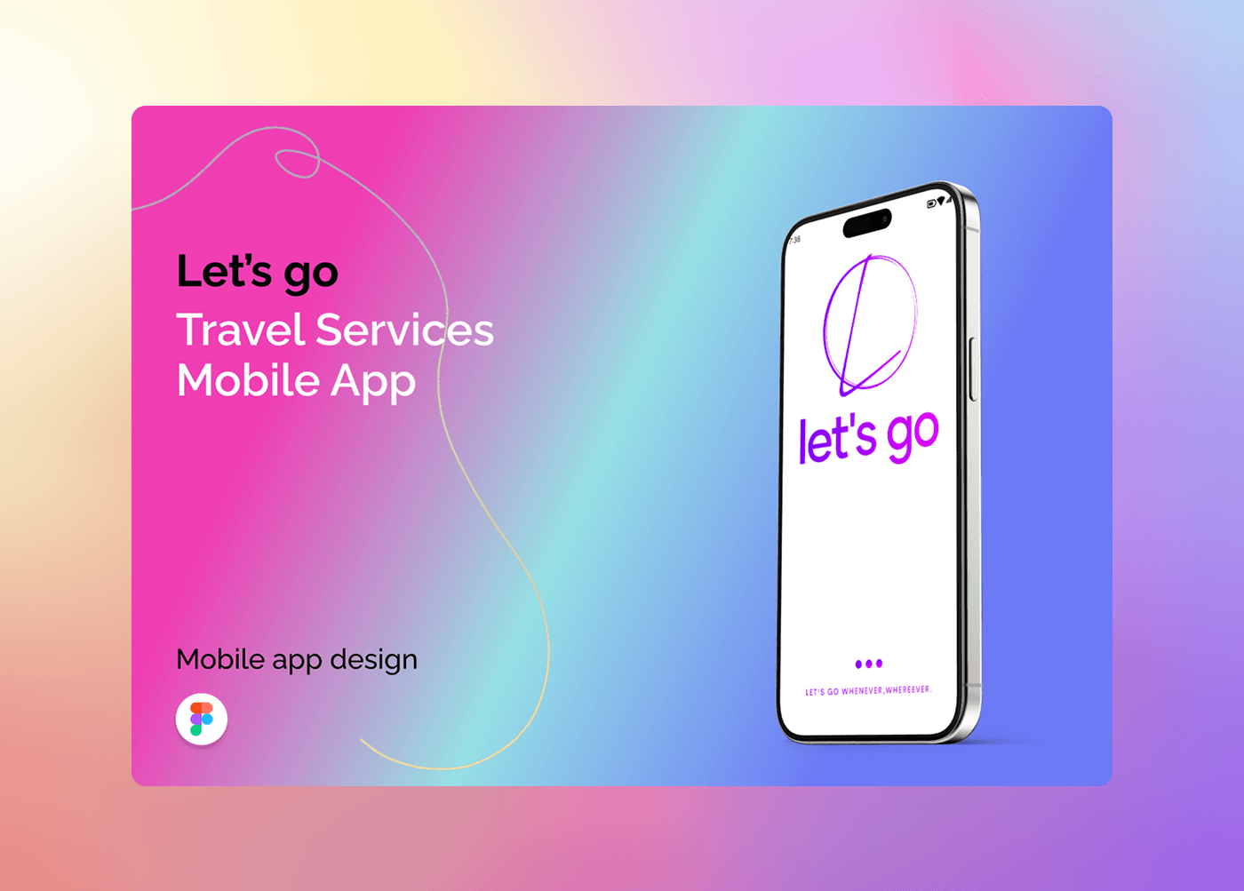
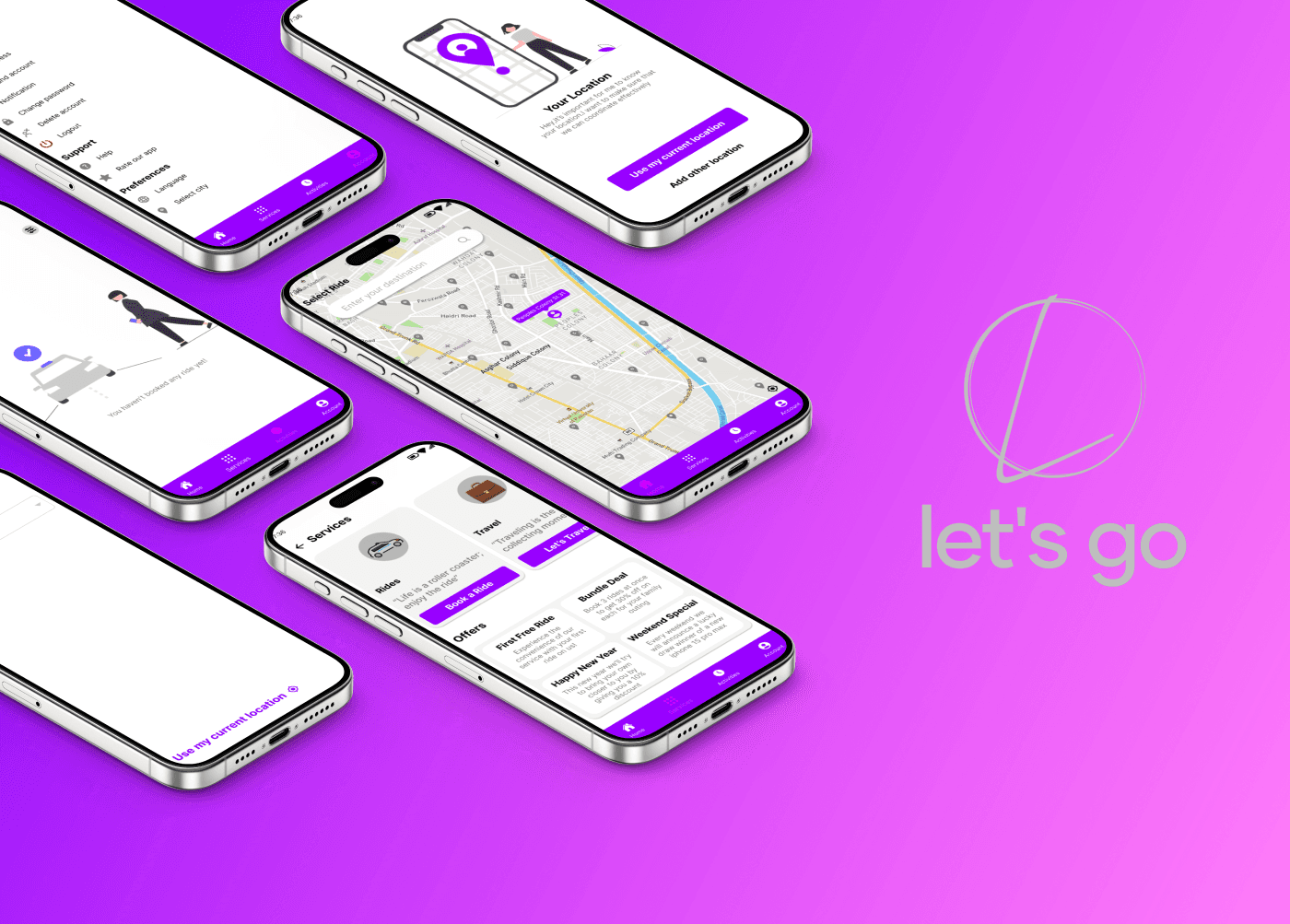
LetsGo - Ride Booking App
Let’s Go is a ride-booking app that makes booking and tracking rides simple and effortless.
Overview
Getting a ride should be effortless, but most apps make it complicated. Multiple steps, unclear ride options, and confusing maps frustrate users.
Let’s Go solves this by creating a fast, intuitive experience, from signing in to booking and tracking rides. So users can focus on getting to their destination.
The Challenge
Users don’t need extra features, they need clarity. Long onboarding flows, too many ride choices, and cluttered interfaces make booking stressful. The real problem isn’t transportation. It’s the journey of booking it.
User Research
Through research and flow analysis, three key insights emerged:
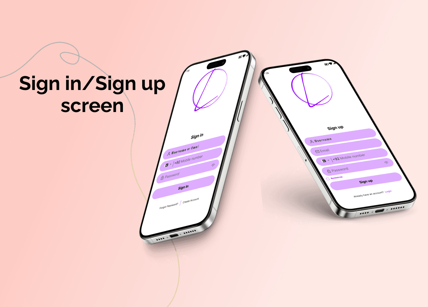
Fast onboarding is critical. Users want to start booking without long forms.
Ride selection must be clear and effortless. Options should be easy to scan and compare.
Tracking builds trust. Seeing the driver in real-time reduces anxiety and improves confidence.
These findings shaped every design decision, ensuring the app feels intuitive and reliable.
Target Audience
Students commuting to campus
Professionals heading to work
Travelers needing quick, reliable transport
Goal: let users book a ride in under 90 seconds without confusion.
Our Approach
Design focused on clarity and efficiency:
Minimal sign-up and input fields
Clear, prominent CTA buttons
Visual hierarchy to guide attention
Map-based ride selection with intuitive interactions
Real-time tracking for confidence
Every element supports the user’s primary goal: book a ride effortlessly.
Outcome
Let’s Go transforms ride booking into a simple, stress-free experience. Users can sign in, select a ride, and reach their destination confidently. The design shows how thoughtful UX simplifies everyday tasks, making travel smooth and enjoyable.